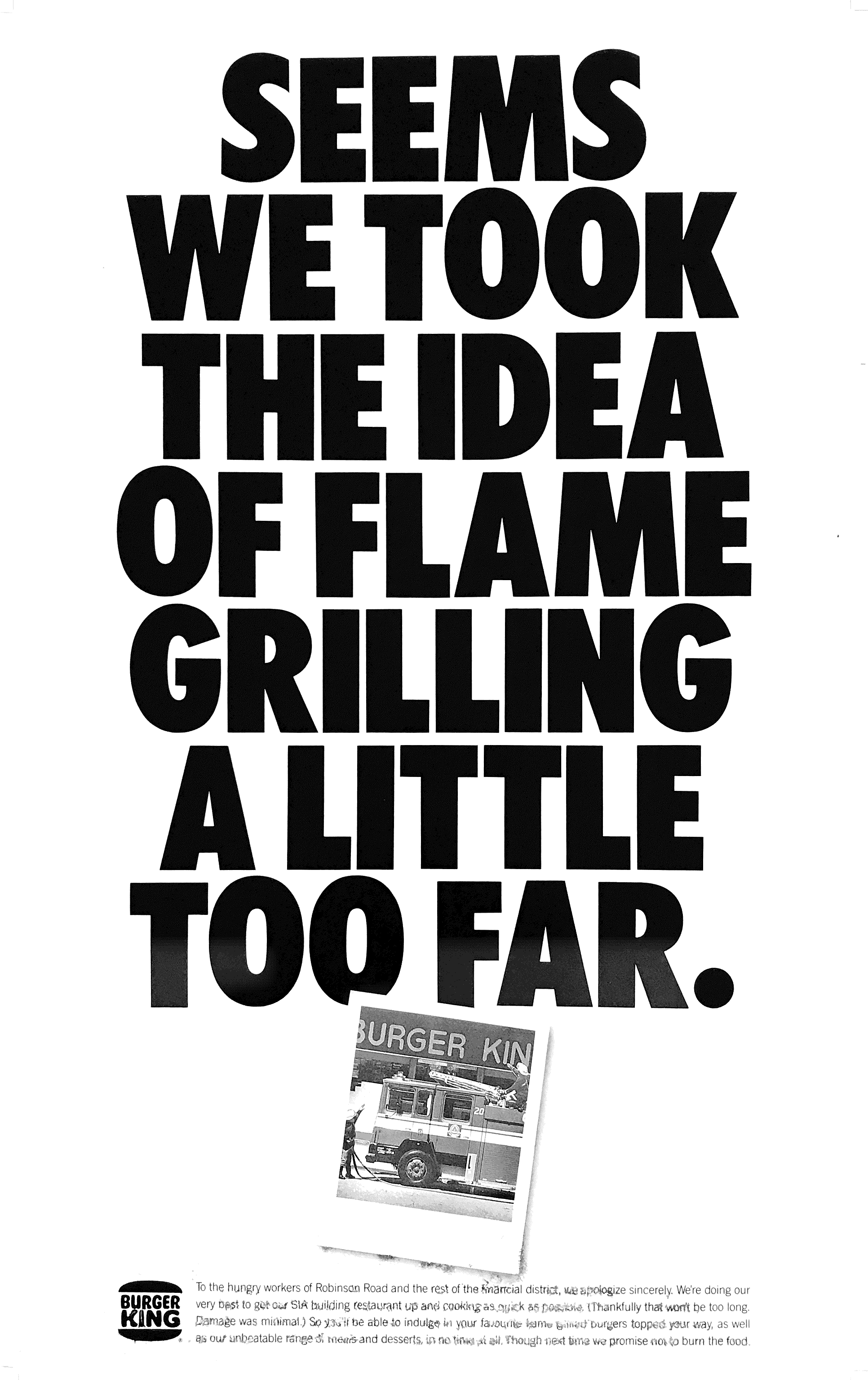
Here’s a print idea created way back in the early 90’s at DMB&B for client Burger King.
As you can see, it’s a tongue-in-cheek topical piece we created on the day of the fire at Burger King Robinson Road to apologize for the restaurant closure. The premise was simple. While we know our loyal fans love our flame grilled flavours, occasionally we burn the food…
The client loved it. Too bad they didn’t have the money to run it. Nor did the agency.
Fast forward to today and here’s the same tongue in cheek approach using a series of fires at Burger King restaurants around the world to celebrate the chain’s heritage and point of difference.
 It’s just picked up the Cannes Gold Lion in Print.

What separates them?

Not the theme or the sentiment. Both use humour to celebrate Burger King’s flame grilled flavours. To create an opportunity. To tell their story.
The answer is 26 years.
Fran Luckin, Chief Creative Officer, Grey, South Africa and Print & Publishing Lions judge said DAVID’s Grand Prix-winning campaign was “playful, authentic, and (had) a sense of being a little more edgy. Embrace your imperfection. It was brave and young, created in a social media age.”
Which just goes to show that there’s no such thing as a new idea.
Just new ways to say it with more reach. Chapeau to Burger King and the David team for making it happen.


You must be logged in to post a comment.